Dear reader, we are changing
From a masthead logo that had three elements -- the pen, flame and the brand name -- we have now refined it to have one primary purpose in the masthead and a strong secondary element to communicate authority that stems from legacy.
Written by Durga Raghunath |Updated: November 20, 2018 9:47:23 am
As in any technology release, over the next two weeks, you will see this experience getting better as we learn and relearn and respond to your feedback.
Dear Reader,
You are one in over 75 million — that’s the size of the rapidly growing community of readers of The Indian Express’s unique brand of journalism, investigative and explanatory, across Print, Mobile and Desktop. This is more than ever before and we are committed to serving every one of you in a way that best meets your news or language (Bengali, Malayalam and Tamil) needs.
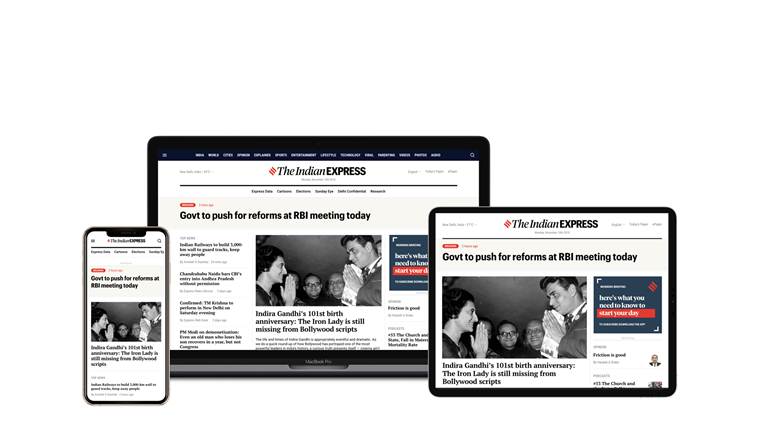
Beginning this midnight, The Indian Express substantively expands and enriches its experience across print, browsers and the app. By furthering our powerful, original journalism and making it come alive through images, audio and video across diversifying coverage.
As a reader of our journalism, as a user of the Express brand, you will see a change in our brand identity as well as user experience
From a masthead logo that had three elements — the pen, flame and the brand name — we have now refined it to have one primary purpose in the masthead and a strong secondary element to communicate authority that stems from legacy. You will see the pen absent from the main masthead but present widely on our platforms as a secondary element associated with truth, transparency and fairness. We have focussed on the flame across social media and apps, as the single element that communicates our brand to users.
The new user experience has three focus areas across browsers and the app:
Look and feel: As we did with The Indian Express App, we have chosen a typography to communicate our core values of fairness, independence and transparency. Without “yelling” we have used typography to produce clarity through useful direction.
Navigation: Clearly defined showcases for breaking news stories, photography, long-form, video, and opinion. These will signal the different contexts to the story. As you use the digital brand, you will also encounter widgets that help you discover more of our journalism.
More context: The Home, Section and Rediscovery experiences have been widgetised to change according to time of day, week and news context. Both on the mobile browser as well as on the app, we aim to make the The Indian Express Feed your first port-of-call.
And finally ads. By changing our ratios, we have reduced the number of ads while making them more impactful. Advertisers will now see more innovation, readers will not wade through clutter.
As in any technology release, over the next two weeks, you will see this experience getting better as we learn and relearn and respond to your feedback.
Welcome.


.png)


No hay comentarios:
Publicar un comentario